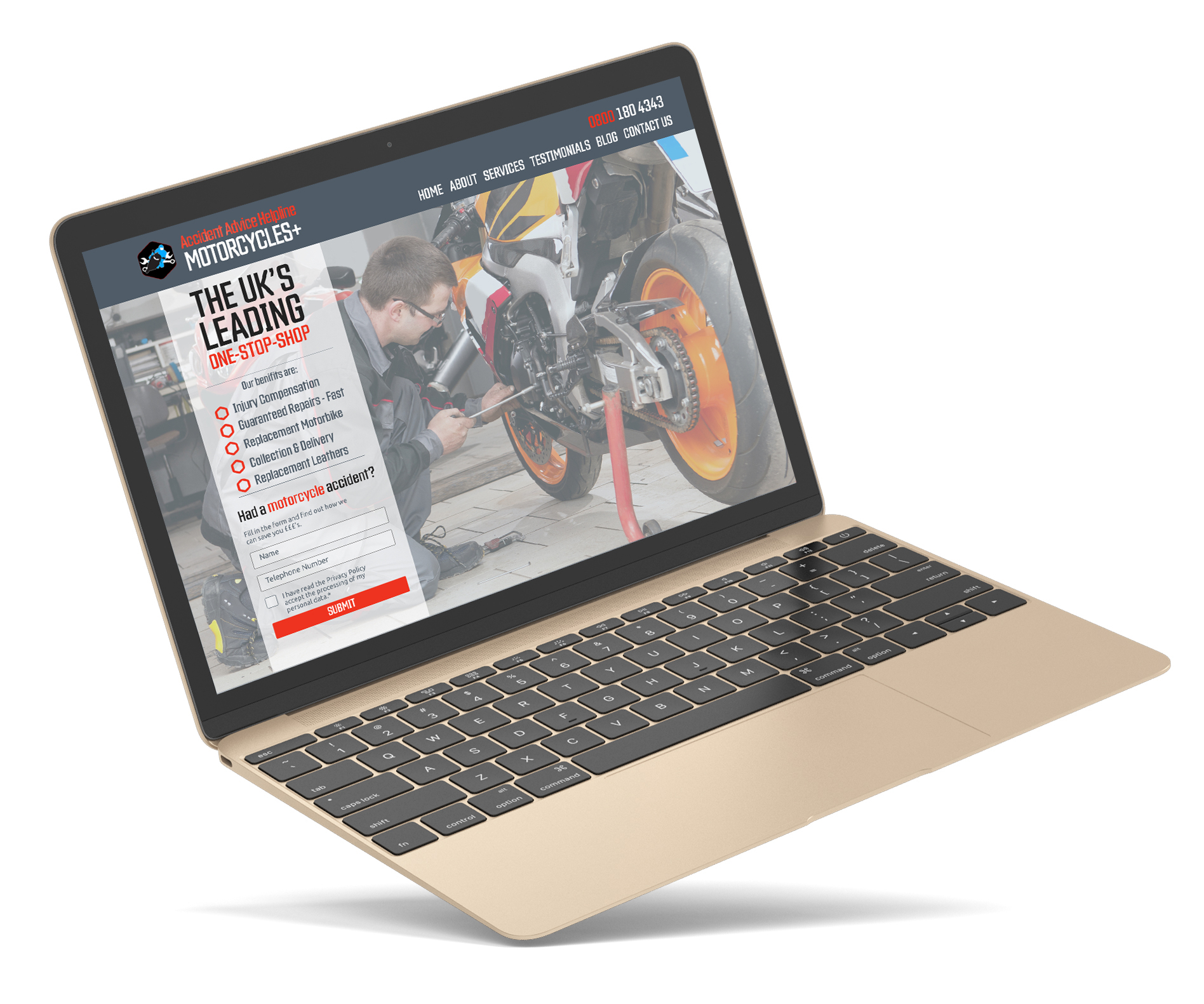
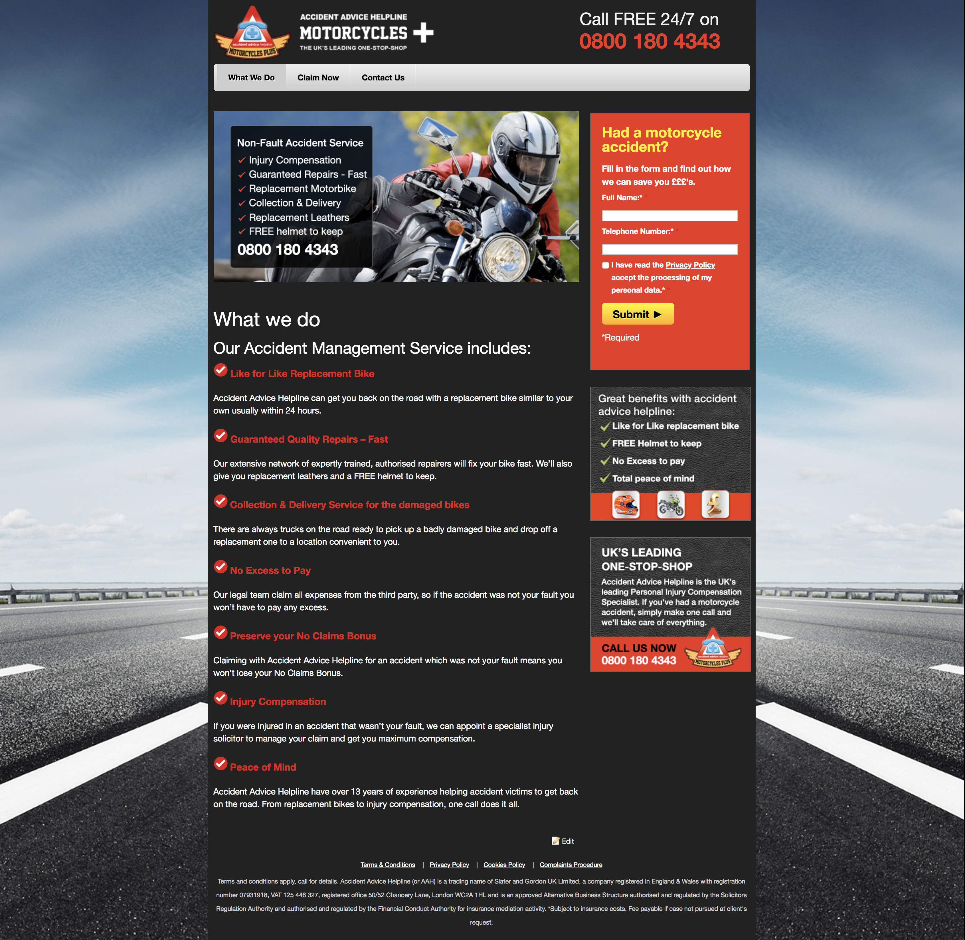
This is a case study based on work I did at Accident Advice Helpline. My task was to redesign the AAH Motorcycle+ website. This is a sub brand that deals with motorcycle accident claims, repairs with other benefits. It is over 5 years old and follows outdated design trends. My main role for this redesign was to create a user experience, which reflects the users' needs better; an interface, which is not only easy-to-use, but provides a satisfactory and meaningful usage.

Initially I ran a website audit, establishing aspect that need improving. The main goal of this website is to make leads. By making user personas I can establish the target audience for the website to improve the conversions.
Here are examples of task that will support conversion:

After the audit, I held stakeholder interviews to ask additions questions to query any aspects of the project.
| Questions | Answers |
|---|---|
|
Why use the domain name Aah bikes? |
|
|
Can the logo be redesigned? |
|
|
Social media integration? |
|
|
Can we add reviews to the website? |
|
|
Could we add SEO pages? |
|
To understand the motorcycle repair market I did a competitor analysis. This helped me understand what they were offering their customers, and how were they doing it? The findings from this will help determine the company strategy.
To help me establish the company goals I did a brand attributes table. I spent time understanding the brand/business I'm design for. Who are they? What do they do? How do you want the customers to feel etc.
| 1. Culture of the business | 2. Customer | 3. Voice | 4. Benefit | 5. Value/ImpactTo the business |
|---|---|---|---|---|
| Suited to motorcyclist Safe Welcoming Trusting |
Motorbikes dynamic Speed Adventurous Active |
Professional Direct No nonsense Modern |
Increased
productivity Revitalised brand |
Benefits Ease of service |
| What is the USP (Xfactor?): The “one stop shop” for motorcycles accident service. Professionally run, established business focused on motorcycles |
||||
To try and visualize the app before I get too dep into high fidelity, I sketch out the various features.
Lastly, I built a prototype demonstrating the outcome of all the work done previously. I based this on the Samsung one UI framework as I find the used of space is more ergonomic.

Pellentesque ornare sem lacinia quam venenatis vestibulum.
It has survived not only five centuries, but also the leap into electronic typesetting industry. Lorem Ipsum is simply dummy text of the printing and industry. Lorem Ipsum typesetting has
Drop a lineTo help me reach the user goals I created two personas. These were created after doing some market research on motorcyclists. This included their gender, age, goals and how the business would suit their needs.
Michael hasn’t had an accident in a while but he’s aware he’ll need to use the services eventually. Through social media (blog link) and word of mouth from other motorcyclist he’s refered to AAH Motorcycles. The reviews are good and there are a number of benefits they have which make them stand out from the other companies. Michael save the link but joins the facebook group as it focuses on motorcycle lifestyle. He notices there is also a rss feed and a instagram group which he also joins.
After a couple of weeks he has his first accident, and he straight away goes to the AAH Motorcycles website as he reads their blog regularly and view their instagram as well. When he gets home he goes to the facebook group where he finds the phone number and contacts them.
Clare has been in a motorcycle accident. Her bike is damaged and unable to be used. Her helmet is damaged and she also has injuries. Returning from hospital shes been contacted several time by her insurance company who are referring a random claims company, who she doesn't know. She is feeling unsure whether to use them. So she opens google’s “motorcycle claims” on her mobile. She searches for a claim company who focus on the motorcyclist. She stumbles on AAH Motorcyclists, she first reads the services and benefits. Then she moves on to the reviews, which are good. After going through the blog section and some more reviews she decides to contact the company by filling in the form.
To show the structure of the website I created a sitemap. This helps ensure the content is where users would expect to find it.
This is useful because:
One of my tasks was to redesign the logo. Through doing many iterations and getting feedback from the stakeholders we came to a final design. The design needed to be simple, involve a modern motorcycle, visual elements of repairing, separated from text for legibility and incorporate the Accident Advice Helpline blue colour.
Before I get to my desktop I find the best approach is to sketch out all variations without any limitations. I find my illustration background makes this easy for me. I can look at UI positioning, colours, desktop/table/mobile screens freely. I can gather user feedback quickly without finalising designs too early.
Overall I found the redesigning the AAH Motorcycle+ brand very clear and concise project. Once the logo was finalised the rest of the project gained motion. Through further user testing and A/B testing the user experience can be refined.